Labels

Sunday, February 11, 2024

Terminology

 These are terminologies I learnt during media class

Reflection: I personally found the terminologies easy to understand because I had previous knowledge of some of them and the rest are pretty self explanatory however, I often forgot to incorporate the terminologies into my work and often still need reminders of the terminology as to not forget them. Additionally I think this post really helped the development of my magazine as I was able to analyze different magazines in my genre with this post open and I have found a pattern of what things were present and what style they took, for example the more casual Mode of  Address, usage of props and the usage of rule of thirds. I think this would be good for making my magazine front cover drafts and possibly even the style of my main article double page spread.

MastheadThe name of the magazine, in its typical font, on the cover
Selling lineThe short description of the ‘identity’ of the magazine under the masthead,
Main imageThe image which fills the cover – a model, celebrity, animal, artefact.
Coverlines‘Teasers’ for the contents of the magazine on the cover.
Typography/fontThe shape, style, size and colour of the letters used.
Drop capThe enlarged initial letter of the first word of an article – an aesthetic feature which is designed to engage the reader.
Pull quotesEnlarged quotes from an article – these may be included in coverlines, but are also used in the body of the article to break up the page and to attract the attention of the reader.
BylineThe name of the writer of the article, usually found at the beginning. Simply, it is the ‘line’ which tells you who the article is by.
Main cover lineThe most important article featured, grabs the audience’s attention (featured article)
Mode of addressThe way the magazine/article addresses the audience. Formal, casual, direct (for images too)
BarcodeUsed for retailers
SkylineA list of keywords featured at the top of the cover
ThirdsThe upper and left third are the most important. why?
PropAn image of an item
Puff / BoxoutA smaller image/text to stand out from the rest of the information (puff=circle. boxout=square)
BuzzwordsExclusive, free, new, special edition
BannerA block of colour with info inside, usually stretches the width of the cover
CaptionInformation about an image.
SpreadPages of a magazine that should be viewed together (usually two)
BorderEmpty space around the edges
White spaceEmpty space in the spread, used to break up the content (negative space)

Saturday, February 10, 2024

Technical skill

 This is a blog about all the technical skills I learnt during the process of making Comp 1

I only really learnt to use Canva better and I have also learnt quite a bit on how to use Lightroom but, the things I learnt on Lightroom is too complex to put here because they're situational to the photo for example, if its a warm bright photo, what kind of preset can I use for it. However I think that this post helped me remember the things I did learn like using google sheets, and I can use that in the future to make my google sheets projects cleaner.

Wednesday, February 7, 2024

Targeting Audiences (Genre Theory, Demographics & Psychographics)

This blog is about the things I have learnt about surrounding Genre theory & targeting audiences using Demographics & Psychographics 

Reflection: This week's classes have been very useful and I know understand better how to categorize and target different audiences using demographics and psychographics, at first I could only use demographics and I still mostly use it now because I found looking for psychographics to be harder than demographics, but after this lesson I think I've been beginning to grasp how to find categorize and target audiences using psychographics more.

Steve Neale' Genre theory

Steve Neale's genre theory states that genre is basically just a case of repetition with differences between 2 similar products that share the repetition. He states that a media text within a genre has to:
  1. Conform enough with the genre's conventions - the norms of the genre, details or choices a genre usually includes - in order to be recognized as part of the genre.
  2. It should subvert some conventions of the genre so that it has some dissimilarities with the original text as a way to be less repetitive or boring in the genre,
Advantages of using genres
  1. Provides a set expectation from the audience, meaning that you already know what they want meaning that you wouldn't have to spend time to look for what they want.
  2. It has a set structure or template that production can use to change into their own media text, although with warping and changing some of it in order to be different from the template.
  3. Audience gets different variations of their favorite set of conventions, meaning there is potentially more to enjoy

Notes from the board in class, during class: 
Explaining the basics of Steve Neale's genre theory and giving some examples to help us grasp how they target audiences. For example, its says there that live action genre is targeted towards older people.


Notes of how to structure an answer to a question which genre theory can be applied to, this also helped me analyze media texts better for their genre, conventions, reasons for subversion and how to better identify their demographics and psychographics.

Tuesday, February 6, 2024

Magazine Development

 This blog will be where I put all ideas for my magazines, for example, masthead, possible layouts and ideas I could use. This will also be where I can review and reflect on decisions that I've kept or changed.

Blue text is my final reflection, aka my reflection from after I've completed the magazine & they're also updates on what I've chosen & why.

Possible Mastheads in order of how likely I am to choose them:

  1. Deutsche Auto!
  2. Auto Nachrichten
  3. The GER
  4. German Imports
  5. Das Automobil
  6. Wöchentliches Auto
I think that using the German words would make that magazine seem to be entirely in German, so that might detract the magazine for some of my potential viewers who are young English speaking Indonesians However I think that the word "Deutsche" & "Auto" are quite easy to understand so it has a good chance. But I think Auto Nachrichten can also work because it might look good to use on a cover, and it has a nice ring to it, but it might be hard to pronounce for those who don't know how to. Additionally, Deutsche Auto & Auto Nachrichten are quite straight forward names, meaning German Auto(mobiles) & Auto(mobile) News respectively, and they both connote that the content will have German cars

I've chosen Deutsche Auto for my final work as its simple to read, understandable even to an English speaking Indonesian as Deutsche is widely known to mean German & "Auto" has a similar counterpart in Indonesian and has the direct same meaning in English, other than that it has a nice ring to it.

Masthead Fonts:

  1. Belleza
  2. ITC Bauhaus
  3. Ahsing
  4. Barbra SemiCondensed 
  5. Bukhari Script
  6. Bodoni FLF
  7. Horizon


Number 1, 2, 4 & 6 are my current favorites but I'll have to see after I make a mock up of what I might want my magazine to look like, and depending on the kind of photos I might want to use. Also what feel I'm trying to get, for example 1, 3 and 6 is quite classy, so I could target a high income demographic while no 4 seems quite stylized & probably more balanced, it also reminds me of the late 70s early 80s psychedelic rock scene which is also coincidentally around the time the E30 was developed & first produced. Maybe I could get a "cool" feel to the cover.

For the font, I've decided to go with Barbra SemiCondensed (4) because my final front cover has a unique color, meaning I should have a unique font to go with it, because I wanted to break conventions and make my magazine contrast by making the borders darker toned. I've gotten this by primary research as I walked by a place selling magazines in the airport and I noted that a very large amount of magazines had bright colored borders.

Layouts:

1. 
For this design, I want to have the Masthead on top & have the main coverline slash across the front cover, past the margins. I also want to have a banner, but I cant decide how much space I want it to take, but using rule of thirds, I think 3/4 of a third is good. The main images will be of a BMW e30 M3 or just any e30 3 series, the first will be a head on shot while the second is a shot that shows the side and some of the front as well so that there is more detail shown but only enough, using Barthes' hermeneutic code, revealing just enough but leaving things like the rear end of the car not revealed, hopefully dragging the reader to buying the magazine to see what its really like.

2. 
On this particular draft, I wanted the banner to take a whole third of the poster but this time it'd be landscape, this is advantageous because I know my Camera (sony a6000)'s maximum resolution is a ratio of 4:6, which is more square in shape, so the banner taking a third would allow me to use a larger amount of the photo. For the image itself, I will have it stretch from left to right, no margins & the subject (car) should only be on the center third of the screen because I want to leave the top blank in order for it to be a bright sky or black sky, this makes it easier for me to contrast the masthead on it, but the shot might be hard to get because there's probably always at least one cloud to ruin the photo.


3. 
This draft is focused more on the car & the things on the banner can definitely be changed if I have a spontaneous idea, but for the shot itself, I want a close up of the headlight of the car, leaving only some space on the bottom so that i can fit in the masthead, for this one I think a sans serif font would work better than a serif one, unless the masthead has to be stacked, then I think a serif one might look better. Besides that this one has high potential but I think that the banner needs some change and the German flag could be changed to be half German and half British just to show that the magazine is not in German but only contains German content from afar.


In my final magazine, I've chosen the 1st option, however with some alterations because it was the most convenient for me to choose as I had recently visited a car meet where I took shots that of the E30 BMW that I knew I could use for my magazine, but the changes were firstly, that I've changed the contents of the banner to show some of the cars featured in the magazine instead of having it be puffs & captions. Secondly I've changed the bottom photo to be the one of the head on shot of the E30, while the top was changed to a picture of a 300sl Mercedes replica because I thought of a coverline which reinforces the idea of a rivalry between Mercedes and BMW, in addition to the changing main images, I thought it'd be a nice touch to overlap the cars over the main coverline strike because in my genre there's a lot of conventions of overlapping text with an insert. Lastly, I've changed where the barcode is located to the bottom left of the main image.

Layouts Real Draft:

Layout 3: 
I have chosen to first do a draft of layout 3 because I had the opportunity to get a shot that fit the description of layout 3. I quite like the left side of the cover if you ignore the Banner. This was my first attempt so I didn't think it looked too bad at the time but after creating a draft of layout 1, I realised that the banner and its contents don't look very appealing and due to its varying margins, it also looks quite amateurish, not to mention the fonts uniform, none are the same size. However the usage of the drop shadow on the Masthead is quite nice and I did like the touch of making the drop shadow of 'EN' from the word 'Nachrichten' turn a darker shade that contrasts the banner as it hits it. Besides that I think that the fonts I've chosen for the main coverline and the masthead fit quite nicely with the color and the feel even though they are different fonts. 


Layout 1: 
Although I liked the masthead on my layout 3 attempt, I think this one has more soul to it & it radiates the same energy as the color palette of the front cover does, but as for now I still haven't found a suitable coverline or usage for the banner, because when I did put the boxout with the caption similar to the one on my layout 3 draft, my teacher suggested against it because it didn't fit my conventions or the style of magazine I was trying to go for.


My final magazine cover did use the same layout as layout 1, but I have changed the idea of using the banner to put text to a place where I put inserts and overlap them with words about how they're featured in the text.

Monday, February 5, 2024

Statement of Intent

 This is a post showing a general overview on what the magazine's contents would be like, however it is not concrete yet and further developments might be made

Reflection: I found it hard to find my target audience as I wanted a niche market but a large enough audience base, so I took time to research the most popular audience demographic for a car magazine, which were young and adult males. Other than that I will also have to change or add some features to my  magazine in order to fit these demographics, hopefully in the future it wont be much of a problem as I already think that currently, what I imagine the magazine would look like, would still be able to cater to the young and adult male demographics

Statement of Intent 

Genre
Foreign Car magazine (car magazine consisted of imported cars from the west)Reason: Currently in Indonesia the car culture is centered with cars manufactured in Indonesia or nearby south asian countries
Primary Target Audience
Demographic:
Age: 21-35
Gender: Male
Ethnicity/Race: Indonesian
Income/Job: High Income
Reason
Age : The magazine could target adults because they’re the primary and majority of the people who find cars as a hobby.
Gender : Males are targeted as it is a common representation of males that they hold interest in cars & that would mean they might want to explore what cars to get as Bandura’s Social Learning theory states audiences might mimic the person being represented by media, which in this case is a stereotype of a man.
Race : I want to target an Indonesian market as I would like to bring in the underground western car scene in Indonesia.
Income : Based off of Blulmer & Katz’s theory of Uses & Gratification, adults might indulge in the magazine as a form of diversion or escapism which is to distract themselves from their lives, they might also use the magazine for surveillance as they might want to figure out what the current car scene is like.

I would also target a higher income group as they would most likely have money to spend on their hobby and my magazine might be able to provide information on what to spend and what the current spending trends of the scene is like so that the person can decide whether to conform or subvert the current tendencies of other people. Another reason is because cars and their internals are expensive.
Psychographic
Lifestyle: Passion for cars
Interests: Appreciation for cars’ looks or performance, car community
Values: community member
Spending habits: cars
Reason
Lifestyle:
Interests: The person should have interests in the looks and or performance of cars as my magazine would most likely display articles surrounding the objective beauty of cars and the possible performance upgrades that can be endorsed, advertised or reviewed in the articles.
Values: I would like to target people who are in or want to get into a community of car enthusiasts because most people who have hobbies relating to cars most likely already have a community they’re in.
Secondary Target Audience
Male Teenagers 12-21Reason
Young male teenagers might find interest in this magazine for similar reasons to adults but more limited, teenagers might use this magazine for surveillance as they are often keen on learning and dreaming about what cars they might want in the future
Content Overview
Reason
Unique Selling Point
Inclusion of articles about western cars, always contains performance metrics and general descriptionReason
Most niche car magazines such as “Classic Mercedes" don’t include the performance metrics of the cars and this might bother some of my targeted audience as they might have interest in the performance of the car
Representations
Western cars are portrayed as cool and stylishReason
To influence the people to have a higher opinion of western cars.
Dominant Reading
Western cars are sought after and are special in the Indonesian car scene.
Audience interaction / Engagement
There will be a community page at the end
Where there can be community questions that can can be answered in the next issue.


The primary demographic of my target audience consists of Males ranging from teenagers 12-21 to adults 21-35 from Indonesia.


As for the psychographics, my media text targets people interested in cars and primarily the people interested in the foreign car culture. These people are most likely to be interested in the community side, specially the foreign car community in Indonesia. My magazine would also try to cater to people who want to educate themselves about the car scene, this could target people using the magazine for surveillance purposes.


My secondary target audience would be young males who want to learn more about the scene as a way to prepare to join it if they have any passion to join it in the future. This secondary target audience has the potential to be more interested as much as the primary audience as the younger people would have likely been exposed to the foreign car cultures due to their exposure in social media. The high amount of young people would also mean that they might not have set values yet so my magazine would also reinforce positive norms and conventions in order to instate the positive values that my magazine would help strive for.


Friday, February 2, 2024

Magazine Research


Uploading: 748914 of 748914 bytes uploaded.

 Here is the research for my magazine.

Making this post has helped with the production of my front cover and article very much, it has also helped me remember what different magazine features I should put on my front cover along with why I should put them there. Furthermore it has also given me an idea on the other deciding factors I should have when I decide to put up something on my magazine for example the audience and media language.


Classic Mercedes

Title: Classic Mercedes
Publisher : Sundial Magazines

Classic Mercedes is a magazine which specializes in vintage Mercedes Benz & AMG cars. The articles are often comprised of a variety of contents like the heritage of the cars to a buyer's guide or an update on a garage find restoration.


The Media Language:                                                    This issue of the Classic Mercedes magazine confides with the genre's norm of having the cover story's car as the main focus of the cover, this is due to the readers often finding the most attractive cover as the typical car guy audience often searches for the beauty of the car.

Representations:
The car has been represented as a higher class compact quality car for the UK market, the magazine shows classic Mercedes cars as the best, the magazine also uses Gerbner's cultivation theory by reinforcing the classic Mercedes motto "Der beste oder nichts" which roughly translates to, the best, or nothing, the quote refers to the old Mercedes mentality where they would not accept any car concept besides the best ones.

Audience: 
The audience of this magazine are older people around 50 to 60. The magazine targets these people firstly due to the cars being older generation cars that would've been already a staple classic by the time most of the target audience would be born, other than that the magazine also uses James Hunt's name, a popular formula 1 driver who raced from 1972-1979, this would mean that by the time the target audience was moving into their teen ages James Hunt would have been a prime driver to be idolized by the kids of the time.

Industry:
The car magazine industry has greatly decreased over decades, this magazine however, most likely wouldn't lose their target audience due to them more likely to be more interested in analog reading compared to the new norm which is having everyone being able to publicly accessible online.

Typography:
The typography of the front cover varies, however it can be observed that the masthead, strapline & the title for the articles within the magazine are shown to have a Sans Serif typeface in order to be more bold & look more consistent in order to be read more easily from a distance possibly to catch the attention of potential buyers passing by. On the other hand extra details are a smaller serif typeface in order to be more easily read from up close once the potential reader comes closer to see what else is contained within the magazine.

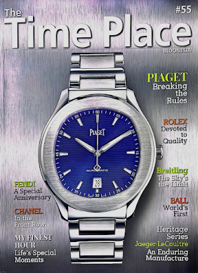
The Time Place

Title: The Time Place
Publisher: Irwan Danny Mussry

    The Time Place is a magazine made by The Time Place store to promote/endorse and review the             watches that they sell. The articles are focused on the current news surrounding different companies       in the industry.

The Media Language & Typography:
This issue of The Time place confides with the norm of a watch magazine by having its main image as a singular photo of a watch and having it be surrounded by the coverlines which consist of Serif typefaces with multiple colors to from the coverline and the straplines underneath them. These all help attract readers, firstly the large front image might interest the target audience for that issue be able to clearly see the watch from afar.
The Serif typefaces used for the coverlines are easy to read from close up because they're meant to be read after the reader comes closer to search for them to find the details. Lastly the Masthead is in a Sans Serif font which is used in coordination with a large font size in order to be readable from a distance as sans serif is easier to make out from a further distance.

Representation:
The magazine represents Piaget as a high quality watch as it shows the watch with a brushed steel surface which is made to compliment the brushed steel surface of the watch which shines. The brand is also represented as a innovative company as shown by one the main coverline's strapline. 
Audience:
The target audience for The Time Place is high income adult to older watch enthusiast males, this is shown through the mature nature of the front cover as it doesn't have unnecessary details which would obscure its primary articles such as intrusive puffs or boxouts, buzzwords and props among other things. Another way older rich men are targeted is through the brands shown, brands that would only be well known among people who find interest in looking through watches.

Industry:
The market for watches magazines has not dropped too much over the years even though the new common media to spread information such as the topics covered in articles on The Time Place can be found on the internet, this is because the primary audience of older people might still want to read with a physical copy because like in Gerbner's cultivation theory which states exposure to some topics through media will reinforce previously mentioned topics, in this case it would be physical copies of written media are better than their digital counterparts.


Smaller researches

Piece 1: Classic Mercedes


Classic Mercedes uses a double page spread for its content page, it shows the cars that appear on the magazine and what page they're featured in, I am fond of this idea as it instantly shows where I can look for the articles and images I might be interested in the most. I could use the double page spread content page in order to make my magazine more straightforward & have it seem a little more organized, I could also use the rule of thirds as this magazine did for their double page spread where the list of contents is on the rightmost third, this further adds to the tidiness. Besides that the magazine mostly uses Sans Serif typefaces with a few exceptions like the left page of the contents page and the small article titled "Wet, wet wet!" This makes the magazine more pleasing to read because the rounded edges of Sans Serif typefaces seem more consistent rather than a Serif one which is often easier to read & more stylish but not as tidy as Sans Serif.


Here is a link to my Double Page spread research & development
-link: https://nathan-regentsmedia.blogspot.com/2023/11/blog-post.html 

Thursday, February 1, 2024

Weekly Progress & Plan

 Here's my weekly progress for the magazine comp 1 project & also a rough plan.

Tracking my weekly progress has made it easier for me to check on what I did in class and I think this might help me with my exams, but other than that the to do feature has made it so that I know what to do next without having to consult a friend, and occasionally, when I'm scrolling through to find my to do list, I often stumble upon lessons that I've forgotten about and I could implement them into my magazine to make it better, for example I saw the "media studies meander" and I instantly remembered what we did on that lesson, on that occasion it didn't really help because that was more focused on section B but it did get me to remember that I had to tweak my statement of intent because I just remembered a few things about audience.

Week 

Term 2

Week 

Term 3

1

(2 Oct)

Brief, Research

8

( 8 Jan)

Development

2

Research

9

Shoot

3

Research

10

Shoot, Self Reflection

4

Proposal 

11

Post Production

5

Development

12

Post Production

6

Development

13

(12 Feb)

Deadline (Monday 12th February)

7

Development

14


Wednesday, January 31, 2024

Component 1 - Brief

 Here is the Brief for component 1. I have decided to choose the magazine option

Reflection: I believe the brief is made out to be very clear and I think I know what to do

Wednesday, October 18, 2023

Stuart Hall: Representation Theory

This post shows what I have learnt about Stuart Hall's representation theory during this week's lesson

Making this has made me remember Stuart Hall's theory along with his name as well because I had to remake it multiple times, with that, I also have a better understanding on how I can portray different cultures or subjects in my work. For example I could portray the car community with a welcoming and positive light, however I will use what I have learnt in this lesson to try and portray them in a good light but as realistic, truthful and neutral as possible as to not mislead my readers but while also possibly welcoming them as well.

1. Representation Theory

Representation Theory was a theory presented by Stuart Hall, where he proposed that in the real world nothing has any fixed meaning. This implies that nothing is directly good or bad, better or worse, instead Hall argued that media is the one that makes the meaning & creates the ideas that come from the media's portrayal of the thing, as his quote states "Media does not reflect meaning. Media creates meaning." 

A part of the representation theory are stereotypes, a stereotype is an oversimplification and generalization of a portrayed group or individual of a certain age, gender, race, ethnicity, social class, religion, disability and sexuality, these oversimplifications can create a negative or positive portrayal however stereotypes are always bad as they portray a specific demographic as only a non complex generalization of what they are in reality.  

A countertype is the opposite of a stereotype, whereas stereotypes display conformities to an overgeneralized public picture and opinion, countertype does the opposite and subverts most of the oversimplifications. Countertypes are not always negative as they can bring more nuance to a character as the character is not limited to what the public thinks they should be based on their characteristics.


2. Stereotypes in Indonesian media

Positively Portrayed: Koreans

source: https://www.instagram.com/p/CxsBoqcRHjU/  (27/09/23)
How they're represented: 
Sound            : non diegetic soft emotional music, softer tone of voice, no loud sounds
Edit                : not a lot of quick cuts, slower paced
Mise en scene: worried facial expression cleaner shaven, properly worn glasses 
Camera angle: high angle shots, medium shot composition

What are the reasons for how they used:
Sound             : To show how the Koreans are soft and kind as the song sets the tone of how the scene                             should feel, which is filled with compassion and worry.
Edit                 : The edit makes the scene feel more flowed and emphasizes the character's emotions
Mise en scene : Worried face further shows compassion of the Koreans, the glasses and facial hair are                              also relatively cleaner to show more neater and civilized people.
Camera angle : The low angle is generally used in order to make the characters look better.