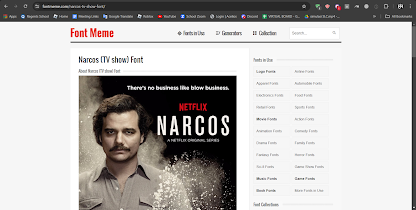
This is the process of how we ended up with our final Thumbnail, post made by Louis
In the beginning, I started by looking at some crime related film project posters, to get a good idea of what mostly the fonts need to be like, as well as gathering inspiration on which font to use and how I would use them in my final project's documentary thumbnail. I used fontmeme.com to take a look at some posters, as I feel like this website quickly shows me what poster of thumbnail it's form, as well as the name of the font
Eventually I was satisfied with the font used in Narcos where it looks simplistic and modern, the look I was trying to go for for my crime documentary. However, I later found out that the information about what font they used was wrong, and it looked slightly different from the way it looked in the thumbnail. because of this, I decided to manually look for the font used from Narcos.
Afterwards, I looked at some Netflix thumbnails to get a good sense of how I should frame my thumbnail. Most crime documentary thumbnails in Netflix have their title on the left hand side, as well as having a red N to signify that it's a Netflix original while having a main subject about the documentary be on the right hand side. So then, I began working on my thumbnail and started by making a few designs
I was very excited with my first draft, and I really liked the way it turned out. I included an image of Resha, who is the celebrity, as well as an autograph on that image, so signify that he's a popular person. I also added blood splatter across the screen to follow crime documentary conventions having blood splatter in their thumbnail, as well as giving a hint that murder is present in this documentary.
I tried to include Resha in the title since the documentary is about how his popularity lead him to doing bad choices. I was unhappy with this design, as I felt like it looked a little bit too cluttered. I really like the previous design, however I needed to incorporate Resha's name into the thumbnail somehow without making it look too cluttered and tacky
Eventually I stuck with this design, having a subtitle called The Resha Case, taking inspiration form Curry and Cyanide's title choice since I feel like it would fit nicely and in the thumbnail using the same font but a thinner version to make it look less messy and cluttery.
Self reflection: With the thumbnail research, I only helped louis with advising him to lower down the brightness of the final thumbnail because I saw that it contrasted too much with other crime documentary thumbnails when I tried to insert the thumbnail into Netflix to see what it would look like if it were on the website.


No comments:
Post a Comment