Labels

Tuesday, March 11, 2025

Song research

This is some small research into the song that we ended up choosing for our music video, done by my teammate louis


Song Background

Telephones were made by an Australian indie band called Vacations, having a laid-back and nostalgic feel. The song was uploaded to Youtube on 2020, and is a part of the album Changes. The song mixes mellow guitar riffs and smooth vocals, which lean into the nostalgic feel that they have created. The song also has some implied meanings of disconnection from people.  

Why we chose it

We chose this song since it's a song that most of us are familiar with, and is also an indie genre. Since it's an indie genre, we believe it could be easy to create a music video for this song since music videos from this genre are typically easy to make since they have a relatively low budget. To us, this makes it seem that our music video would seem believable or realistic for the song.

How our music video will be different

As of now, there isn't an official music video for the song yet. So we decided how we could create one for the song. From this, we could predict how the music video would be like, whether they explore similar themes with us or are completely different from our music video.

Reflection: Reading the research that my friend has made on the song has given me a general structure on how the video will play out like where the climax will be and how it will be edited.


Storyboard

 This blog contains the first drafts of the storyboard for our music video


Reflection: This storyboard will be a good basis on how the rest of the scenes will play out and it gives the direction of what kind of feelings will be portrayed in our music video

Further reflection: This reflection is written after the music video was finished, we ended up removing the scene that is depicted in this storyboard but it was very influential in the final product as when it was in the first few drafts of the videos, it helped set up the mood that we then followed up with in other recording sessions.

Lyrics

 This is the lyrics to the song we are using for the music video

Rise with the morning
You call to me
My thoughts are crawling
You're all I see

I wish I could live without you
But you're a part of me
Wherever I go
You'll always be next to me

Fall into the night
As I gaze into you
Shine so bright
It's all I do

I wish I could live without you
But you're a part of me

Wherever I go
You'll always be next to me

Reflection: The lyrics to this song are applicable to many situations from friendship, romance to addiction to something as it is a song which details about how phones have become mythic. We want to play off of this as we will try to make the music video have a feeling where these people are so close their existence is mythic to each other. 

Moodboard

This is a mood board which our group has created as a whole to set up a general feeling and branding for our project.


Reflection: working on this as a group has given us helped us visualize what we are aiming to make, this will definitely help us not misunderstand what we're trying to make and it will help our content be consistent across music video, digipack and social media even if different people are doing it because we have this mood board to go off of


Theory of Stardom

This blogpost is done by Haresha, It includes a summary on what we have learnt in class about the theory of stardom and includes our group's research on the theory stardom's real life examples.

STARDOM THEORY
Richard Dyer’s Stardom Theory suggested that celebrities are developed and presented by the media industry to the public eye or the audience as an idol (their "ideal" type of person they dreamed of), which often represent a specific persona that are engaging and appealing to the targeted demographic. The purpose of doing this is to sell media company's products and/or just generating popularity in general.

Persona can be divided into two types:
  1. REAL persona
    A curated version of themselves, designed to fit the expectations of an audience; to REEL or to attract the audience.
    Eg. Performances, Music videos, social media
  2. REAL persona
    The authentic personality of the star— it means how they really behave (they're real personality as an individual) in their personal life, behind the stages, and away from camera
    Eg. Interviews, documentaries, behind-the-scenes footage


Why are celebrities appealing? 
  1. Love: We are fascinated with the love lives of the stars, can also feel a romantic affiliation with them
  2. Ordinariness: We like to see them doing routine things, living normal lives just like our own
  3. Success: We like the idea of overnight success, and failure before success. This appeals to our
    sense of fair play. (Why we like reality TV so much)
  4. Consumption: We are fascinated by the huge material wealth brought by media success. Not just
    luxury homes and cars, but also strict dietary regimes set by expensive nutritionists, holidays etc.
  5. Dream turned sour (downfall): fascination with the exploitation of their misery


Names:

Neta’an & reszha’a

Celebrity:

d4vd (David Anthony Burke)

REEL persona:

Instagram: He portrays himself as a down to earth average American teenager who occasionally has celebrity type posts (professional photographer’s works of him and self promotion)
Music: Often in his music, it is about a struggle in romance and almost always losing in his music videos.

REAL persona:

From what is publicly available, d4vd is a humble and private person, keeping his online personality separate from his private one, he often plays video games, expressing interest in Fortnite. He also enjoys watching movies.

Love:

Currently, he doesn't publicly have his partner shown, rather keeping it more private in the short run.

Ordinariness:

In his instagram, he openly shares and updates his day-to-day activities. Such as when he is in the middle of the concert performing his songs, a photo of behind the scene for his upcoming music video, and his frequent selfies.

Success:

He was an almost overnight sensation success, the vocal track for his chart topping “Romantic Homicide” song was recorded on an iphone as he didn't have anything else to record it on, he has commented that he could’ve done the recording on his computer but his terrible wireless headset quality was just not a usable choice.

Consumption:

He spends his money on video games and on his computer. There are also lots of posts of him going out, not necessarily to high class or expensive places. Lastly, from what I can tell, he drives a Tesla as the Tesla-ish car interior was shown on one of his photos on his instagram.

Dream turned sour:

No reports or news has spoken out or have rumored d4vd’s involvement in any kind of scandal

Names:

Ata & Louis

Celebrity:

Andrew Tate

REEL persona:

What image to they project through their work (films, music, social media)

Social media platforms portray Andrew Tate as someone who has a unique sense of masculinity and is said to be an extremely hard worker that eventually achieves success from it through his suffering. Andrew tate typically shows off his success and masculinity through his stories and by displaying expensive products he owns

REAL persona:

Have there been any cracks in this image (examples)

Yes, such as Andrew being wholesome to one of its students / fans after that person made money from his course. Congratulated him in front of all Andrew Tate’s audience on screen. Also

Love:

How is their love life reported on?

Andrew Tate had links with many different famous and young celebrities such as Sofia Guliyeva, Naghel Georgiana Manuela, and Lori Harvey.

Ordinariness:

Do the media try to show them as everyday individuals like you?

No, sometimes even showed his past which he also had an interest in riding motorcycles like I do now.

Success:

What is their success story? How is it told?

Andrew Tate’s success story leans more to the overnight success stereotype. He states that he gained his wealth through his ventures in Hustler’s University, social media, and casino businesses. From there he gained a massive audience, and had his name talked about in conversations, gaining popularity.

Consumption:

Can you find any articles that celebrate their luxurious lifestyles? Or their extreme diets?

Tate tends to show off how much he’s spent on a product (which is mostly extremely expensive) and brags about the excessive amounts of money he has. Tate only spends money on typical rich people products that can be easily flexed such as expensive watches, sports cars

Dream turned sour:

Has this celebrity had a downfall? How is it reported? Did they recover?

Yes, at some point he was reportedly abusing two women he met on the internet which then the police department took all of his luxury vehicles and barged into his and his brother’s (Tristan Tate) home. However, it was found that both of those women actually falsely accused Andrew Tate for human trafficking but Andrew Tate couldn’t bring back his luxury cars home. Few months later he recovered his popularity after the allegation was over and went famous


Reflection: Doing the research on these artists has given us a better idea on branding and what kind of content we need to make for our digipack and social media, the research has greatly helped Haresha who is in charge of the social media aspect in our group as it includes how artists portray themselves, their private lives and also what dominant reading they try to push out through the media texts that they output.

Statement of Intent

This post will have our rough idea for who our media text will target and what the text itself aims to do or achieve, such as how we will engage with the audience, what we will represent and how we will do it.

Genre
Indie
Song Choice
Telephones - Vacations
Target Audience
DemographicYoung teenagers to young adults, the ages of between 16-25. Any ethnicity. With middle income

Age: 16-25
Gender: Appeals to all genders
Ethnicity: Any
Income: Middle Class
Location: Urban
Occupation: Students
PsychographicPeople who want to vibe and feel euphoric senses. Especially those who love Indie music

Values : friendship, past, reminiscing, nostalgic
Attitudes: Those who value authenticity and enjoy having a relaxing and laid-back feel
Lifestyles: People who like to reminisce on their past fond memories 
How we will appeal to this target audience
We will appeal to the target audience by incorporating lifestyle and activities similar to the ones mentioned in the psychographic in the music video. Most of the actors would also be teenagers to fit with the more teenage demographic that seem to be currently struggling in their situation. We'll also have a more aesthetic visual to appeal to teens since teens nowadays enjoy aesthetic elements
Main inspirations
Sunny Days - Reality Club
Romantic Homicide - d4vd
Artist Description (Star)
(Who is your artist/s?)

Ata - Singer
Haresha - Bassist
Nathan - Guitarist
Louis - Keyboard
Performance
(what types of performance will you have?)

Lip-Syncing
Instrument Performances
Representations in video
(people/places/locations)

People in the video will be teenagers or young adults who are in the process of a breakup but are not able to move on from their loved ones. “I wish I could live without you but you're part of me” shows that these people are still attached to who they once loved. As well as reminiscing your childhood fun and playful memories.

The places and locations in the video will be represented as elements that help jog both sad and happy memories from the past.
Star Persona
(We will study this next week)
Proposed Roles
StoryboardNathan
Location ScoutHaresha
Risk AssessmentHaresha
Screen TestWhole Media Class
Filming ScheduleHaresha
Audience researchAta
Behind-the-scenesAta
EditingLouis
Digipak (research & development)Louis
Social Media(research & development)Nathan

Reflection: By using this statement of intent, it has given me a general idea on how things will work out for this & now we have a structure of who takes on what kind of work based on what we enjoy doing personally and also determined by our skillset.

Further Reflection: This reflection is written a few days before deadline, there were many changes made and we did not entirely follow through as with our statement of intent as social media research was handed over to Haresha as well as editing being handed over to me as I had more experience in rhythmic editing which would help with our music video, also as an amateur colorist I could use color grading to express the mood of the scene better if I was the one to color grade the footage.

Monday, February 3, 2025

Production: File Organisation

 This post, contains the methods I used for my file organization to make editing easier and less time consuming. 


In the main folder, It is divided into the different days of recording, this way it is easy for me to remember what scenes are in which folders.

Inside the day folders, I organize the names of each recordings with the same format, first is the scene (b for beach and s for store then est for establishing shot) then there are the variations of the shots (A, B, C) so that it would be easier for me to remember which shot works the best in the edit. And for some of the shots with similar locations such as in the store.


Reflection Doing this actually helped me a lot for editing most of it because I have scrapped and reedited the drafts completely from scratch 3 times, and with each time it was easier for me to remember and sort the scenes together.

Monday, January 20, 2025

Digipak: Research & Development

Digipak Research & Development of our group, made by groupmate, Louis


In this blogpost, I will show the album covers and digipak backsides that I've looked at as inspiration for my front cover and back cover digipak, as well as my progress in creating the digipak.

Here are some indie album that I've taken a look at for my digipak

These Indie album covers seem to follow a convention of having grainy imagery of an abstract photo that may have meaning behind it, sometimes being poorly lit. Some album covers also feature duo-toned imagery. The typeface used for all of these covers seem to be sans serif typefaces. These are the visuals that I will attempt to replicate in order to conform to Indie album cover conventions.

Instead of putting all the sides of the digipak in one file, I decided that I'll do it in sections, front cover, back cover, spine, etc.
I will be using the template above that I've found from the internet as a sort of reference to measurements that will be needed for my digipak. Once I've completed the different each section, I will then combine them all in one file according to the measurements and orientation of the reference above.


Here are my first batch of drafts


I used these images as they reflect the sad story covered in the music video. For all of these images, I've followed the abstract hidden meaning convention, where each image has more to it when not taken at face value. 

For my 1st draft (top left) I chose the image, as it used an extreme long shot and some neon lights being shown. I've done this to show isolation and loneliness done by the extreme long shot, and a hint of happiness represented by the minimal colorful neon light, to reflect how the music video's story is how the star has become lonely and lost his friends. The hint of happiness is also shown in the music video when the star was reminiscing the fun memories with his friends.

For my 2nd draft (top right) I also chose this image since it shows someone being alone which explicitly tells the viewer themes of isolation. This is done through the long shot showing no-one around the area except for 1 person in the middle of the screen. However, The hint of happiness isn't represented by the neon light but instead with the yellow-orange street lamp since the colour yellow connotes joy and happiness, though, I think that it's a little too prominent to only show a hint of joy.

My 3rd draft (bottom) was chosen since it shows both the extreme long shot for isolation, and the neon light for a little bit of cheerfulness. The most prominent reason for choosing that image was because it had both those technical elements as well as a sign facing away from the camera. I liked this since it connotes that there is hidden meaning that the viewer isn't able to tell right away, but is present in the cover. Though this could also connect to the hidden reason on why the star had lost his friends, since it wasn't explicitly explained in the music video.

I was unhappy with these drafts as to me they weren't appealing enough for a general audience. I also noticed that I failed to follow the convention of sans serif fonts, so I decided to make a few more drafts for the front cover digipak. I also later realised that the measurements were not the same as the reference.


Here are my second batch of drafts

I used these images since the main song of the album and the album name is "TELEPHONES", and these images feature a telephone. I've done this so that the audience can make a quicker connection to the music video so that they wouldn't need to look to hard to look at hidden meaning so that they'll quickly be able to realise and make connections through the branding.

My fourth draft (top left) had the name of the album on a bit of a corner to explicitly make the audience create connections. I've tried to use a yellow tint to represent the happiness this time, however, I think that the yellow was shown too prominently so it was no longer just a hint and is excessive. Later on the typeface to me seemed too aggressive for a much slower paced song, so I decided to lessen the intensity of it in later drafts.

My fifth draft (top left) I realised that I loosely followed the conventions in the first draft, so I continued with the sans serif typeface that indie covers have, however I added a bit of texture to the title so that It would look too boring. I also got rid of the yellow tint since, it was too excessive in the first one, however I did not find a way to show the small bit of happiness in this draft. even though the serif typface was already used to conform to conventions, I've tried to use another cursive typeface for the band name in order to slightly subvert from Indie cover conventions.

For my sixth draft (bottom) I've changed the serif typeface to be a little skinnier and get rid of the texture since it was it looked too distracting and out of place for me, everything else remained the same, however I've added more texture to make the cover seem a lot more messy and noisy to conform to conventions.

These drafts to me still felt too bland, since the image looked like it was barely touched and I failed to conform to the duotone convention. I've also realised that the latest draft looked to messy for my liking and could be changed to make it still look appealing while it not being to noisy.


These are my third batch of drafts
For my third batch, I've used the same image as the last batch, however this time, I've implemented the duotone convention.

for my seventh draft, I haven't implemented the duotone effect, however I tried to change the placements of the title and band name to make it look more appealing for the audience and less boring. The title colour has also been changed so that it uses the colour blue, to show sadness and connect it with the depressing themes of the song and music video. I've also dimmed down the amount of messy white highlights on the cover since it looked to messy in the previous draft. I've also added a bit of noise and grain to conform to the textured grainy look to Indie covers.

For my Eight draft, I've repositioned the texts so that they were in the original spot, however this time I've added the duotone effect, with the two colours being blue & yellow, in order to show both the happy and sad feelings that the music video connotes. The telephone is mostly the yellow part since the happiest moments of the star was when he could call back to memories with his friends.

For my ninth and final draft, the only thing I've changed is the position of the texts, to make it the same as my sevent draft, while having the duotone colours from my eight draft. Everything else is kept the same.

I feel satisfied with with ninth draft and will probably use it as the front cover of my digipak. I'm beginning to see the theme and visual for my digipak, so I will continue to follow the visuals from the front cover and bring it over to the back cover as well.


Here are some back covers and spine digipaks that I've taken a look at for my digipak

The back of digipaks often give have a track list on the left hand side of the back cover, featuring the songs that are inside of the disc in the digipak. The back cover also shows a bar code on either corners of the back, as well as some legal infringement commonly done near the bottom of the backside. The spines are also included in some of these, where it features mainly only the artist name as well as the album name.

Here are some of my back cover and spine drafts


Here are the first couple drafts of my backside digipak. Since, I've already have a theme and a visual I can follow, it made it easier for me to create the next sections since I've already have an idea for what I need to follow. For my back cover, I used the main song as the first song on the track list, with the rest being lesser non-important songs. I've followed the duotone and grainy visuals I had with the front cover, and I've also included the band's name on the back of the digipak. I've also put the band's name and album name on the spine of the digipak.. I Since these drafts are very similar with the only difference being the placement of the band name and barcode, I think I'll go with the second draft (left) as the official back cover and my spine draft as the official spine.

Here is an example that I found of the inside of an Indie digipak


The inside of Indie digipaks often show the entire band, meaning all the band members in one frame and shot on the inside of their digipaks. Continuing to follow the conventions of the digipak's cover, duotone, grainy,
etc.


These are my drafts for the inside of the digipak, I think they look alright as they follow the conventions and look good enough for the audience. Since showing the members is part of the conventions, audiences also get to see the band members.

Here is the final Digipak in the form of the reference


Reflection: I helped with some of the digipack, especially near the begining, setting up that we would use a specific set of colors and iit first started with neon colors then louis further developed it to using a yellow + blue duotone design which I think perfectly encapsulates the idea of an indie album cover which often times is abstract but gives the general feel and what you would expect from the album. 

Social Media: Research & Development

This blogpost is the research & development for our social media page and how we engage with the audience through it. This blogpost was made by Haresha.


RESEARCH #1: VACATIONS


What do they post on their social media page? Can you group the different posts into categories (eg Personal, promotional etc)

Just like other bands, the Vacations share updates and activities for their fans to keep them informed about the band's current state, endeavors, and other aspects related to the band. What adds a personal touch to their account is their sharing of daily behind-the-scenes activities. They also frequently post memes that are mostly related about themselves, which adds a more relaxed and playful vibe to the band. This contributes to the development of their image as a fun and laid-back band on their social media pages, contrasting to their musical persona that they've shown in the music (composed). In addition to sharing personal insights, they also create promotional content, primarily focused on their tour schedules that include dates and locations for their concerts.

Does it feel personal or is someone else creating content for them?

Their social media profiles come across as more personal instead of being managed by a team or a corporate that filters the content of their post for the sake of their official accounts. It seems that their goal is to connect with the audience by presenting themselves as relatable, choosing to be seen as a humble, and fun band rather than as glamorous or formal superstars.

Do fans have the chance to interact and engage with a. The artist b. Other fans

Fans of VACATIONS is possible to interact with the artist (a) through the instagram comment sections, but it seems that the band choose did not make any interaction with the fans throughout their social pages. It seems that instagram acts as an update of what are they up to and an announcement of tours; basically, an update of their activity in general. But, fans can still interact with the other fans (b) through the comment sections, and it is most likely to discuss and share their thoughts about the band's posts.

How does the artist promote their music?

They promote their music/bands through their social media pages while posting memes to maintain a relaxed engagement of the band between their audiences. They're the most actives in Instagram and Tiktok, as they got the most engagement on those social media platform.

How has this soc media influenced you?

We would like to conform the meme posting contents that they did in their social media pages, as we want our band to be known the same way as them, which is a playful and easy-going persona that we show in social media. The reason why this is necessary is because we want


RESEARCH #2: REALITY CLUBS


What do they post on their social media page? Can you group the different posts into categories (eg Personal, promotional etc)

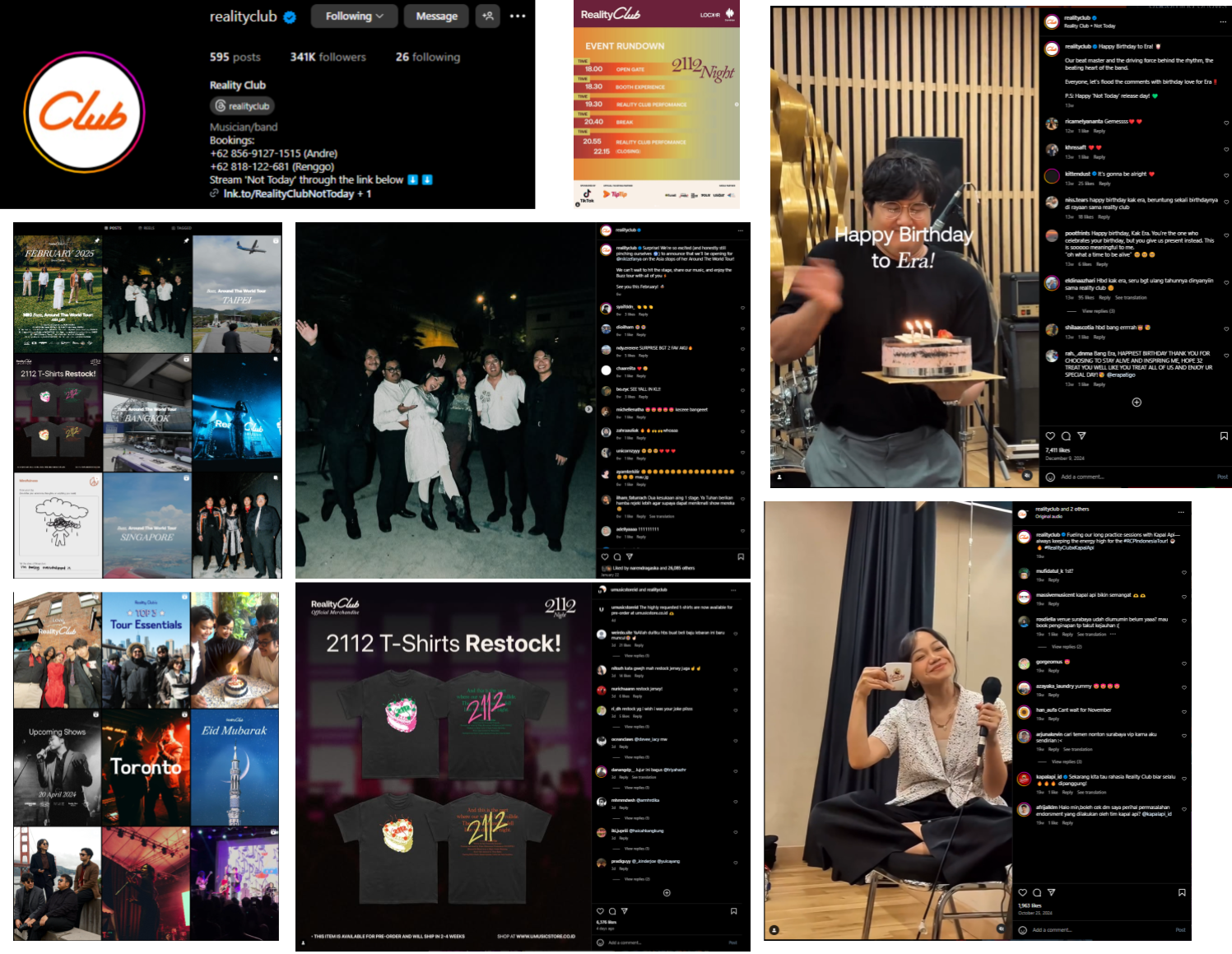
On their social media platforms, they post updates about the band’s activities and share information regarding their current situation to keep their fans in the loop. Furthermore, they have recently uploaded mini-vlogs showcasing the city they are visiting for their latest concert series, known as the BUZZ Tour, which they refer to as "stage journal." They also seem to be promoting their merchandise through their social media channels. Overall, their social media posts are mostly well-polished and professionally edited.

Does it feel personal or is someone else creating content for them?

For Reality Clubs it looks like a team of social media sections and photographers are behind the band while developing, creating, and filtering contents that are allowed to be posted to the band's social media page.

Do fans have the chance to interact and engage with a. The artist b. Other fans

In the majority of their social media updates, there is no indication that the band replies to or engages with comments from their fans. The comments section is consistently filled with fans sharing their support and motivational messages for the band. When the post pertains to an upcoming concert, attendees express their enthusiasm about the band performing in their cities, which boosts engagement and excitement among fans. While they may not communicate on social media, they do connect with their audience during live performances.

How does the artist promote their music?

Reality Club promotes their music through social media, such as Instagrams as the main platform. Other than that, they also promote their music through live performances and world tours (e.g. BUZZ Tour) in order to increase the awareness for their new music amongst their loyal fans. Not only that, they feature they're new released on their social media bio.

How has this soc media influenced you?

The vibrant neon colors on some posts inspired us to assign a unique color theme to each member of our band. For example, the neon color associated with Louis would be red. When he is the spotlight/at least present in a post, ambiance of that post will closely reflect the color red as well. This color will be symbolising the personality of the respective member.

1st drafts


This is our first social media draft, where we tried to visualise what will our band's social media post looks like at first.


2nd draft

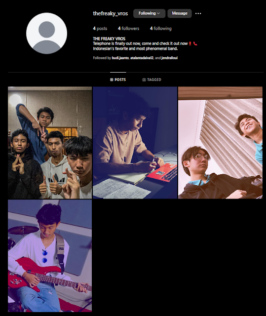
Here is our official instagram account after we posts some pictures.


Reflection: This research has helped Haresha but it has also helped me with my portrayal of our members in our music video such as how Ata is seen as serious most of the times & how the color blue is used when he's alone.